Banners are a powerful tool for marketing and communication, providing a visually striking way to convey messages, promote events, or advertise products. Whether used in digital or print form, mastering banner design can significantly enhance your ability to capture and retain audience attention. In this article, we’ll delve into the essentials of banner design, covering the basics to advanced techniques that ensure your banners stand out and achieve their intended purpose.

Understanding the Basics of Banner Design: A Beginner's Guide
Banner design, at its core, is about creating a visual representation that communicates a clear message. The process begins with understanding your target audience and the primary goal of your banner. Are you looking to drive traffic to a website, promote a sale, or announce an event? Clarifying this purpose will guide your design choices.
Next, consider the basic components of a banner: the background, images, text, and call-to-action (CTA). A successful banner design integrates these elements harmoniously, ensuring that the message is not only clear but also compelling.
Key Elements of Effective Banner Design: Layout, Color, and Typography
Three crucial elements of banner design are layout, color, and typography.
Layout: The arrangement of elements within your banner should lead the viewer's eye in a logical manner, typically from the most important information to supporting details. Employing a grid system can help maintain consistency and alignment, creating a balanced and professional appearance.
Color: Colors evoke emotions and can influence perceptions. Choose a color scheme that aligns with your brand and the message you want to convey. For instance, red can create a sense of urgency, while blue often conveys trust and reliability. Ensure sufficient contrast between text and background to enhance readability.
Typography: Font choice and size are critical for readability and aesthetics. Stick to one or two complementary fonts to avoid visual clutter. Headings should be bold and prominent, while body text should be clear and legible.
How to Choose the Right Size and Format for Your Banner
Banners come in various sizes and formats, each suited to different purposes and platforms. Common digital banner sizes include leaderboard (728x90 pixels), skyscraper (160x600 pixels), and medium rectangle (300x250 pixels). For print banners, sizes can range from small tabletop banners to large outdoor billboards.
Choose the size based on where your banner will be displayed and the level of visibility you need. A large outdoor banner, for instance, requires a simple design with minimal text, ensuring it can be read from a distance. Conversely, a website banner allows for more detail since viewers are closer to their screens.
Banner Design: Essential Tips and Techniques for Stunning Visuals
The Importance of High-Quality Images in Banner Design
High-quality images are a cornerstone of effective banner design. Grainy or pixelated images can detract from your message and create a negative impression. Use high-resolution images that are relevant to your content and resonate with your audience.
Stock photo libraries can be valuable resources, but ensure you choose images that don’t look overly staged or generic. Custom graphics or professional photography can add a unique and authentic touch to your banners, setting them apart from competitors.

Tips for Creating Eye-Catching and Engaging Banner Designs
Creating an eye-catching banner involves more than just attractive visuals; it requires a strategic approach to design. Here are some tips to help your banners stand out:
- Simplicity: Avoid clutter by focusing on one primary message. Too much information can overwhelm viewers and dilute your message.
- Contrast: Use contrasting colors and bold fonts to draw attention to key elements, such as the headline and CTA.
- Whitespace: Don’t be afraid to leave empty spaces in your design. Whitespace can enhance readability and highlight important content.
- Animation: Subtle animations can grab attention and make your banner more dynamic. However, ensure they are not distracting or slow to load.
Best Practices for Designing Mobile-Friendly Banners

With the increasing use of mobile devices, designing mobile-friendly banners is crucial. Mobile screens are smaller, so your design must be clear and impactful even at reduced sizes.
- Responsive Design: Ensure your banner adjusts well to different screen sizes without losing its effectiveness.
- Readable Text: Use larger fonts and minimal text to ensure readability on smaller screens.
- Optimized Images: Compress images to reduce loading times without compromising quality.
- Touch-Friendly CTA: Make sure CTAs are large enough to be easily tapped on touchscreens.
How to Optimize Banner Designs for Better SEO Performance
While banner design is primarily a visual task, it can also impact your site's SEO. Here’s how to optimize your banners:
- Alt Text: Use descriptive alt text for images to help search engines understand the content.
- File Names: Name your image files with relevant keywords instead of generic names like "banner1.jpg."
- Loading Speed: Optimize file sizes to ensure fast loading times, as slow pages can negatively affect SEO.
- Mobile Optimization: Mobile-friendly banners contribute to a better user experience, which can positively impact search rankings.
Using Visual Hierarchy to Enhance Banner Design Impact

Visual hierarchy refers to the arrangement of elements in a way that guides the viewer’s eye through the content in order of importance.
- Headlines: Make headlines the most prominent element to capture attention immediately.
- Subheadings: Use subheadings to break down information into digestible parts.
- CTAs: Place CTAs in a noticeable location and use contrasting colors to make them stand out.
- Images: Use images to draw attention and support the textual content.
Common Mistakes to Avoid in Banner Design
Avoiding common mistakes can significantly improve the effectiveness of your banner designs:
- Overcrowding: Don’t cram too much information into one banner. Focus on a clear, concise message.
- Poor Contrast: Ensure there is enough contrast between text and background for readability.
- Ignoring Brand Consistency: Maintain consistency with your brand’s colors, fonts, and style to reinforce brand recognition.
- Neglecting CTA: Every banner should have a clear and compelling CTA guiding viewers on the next step.
Tools and Resources for Creating Professional Banner Designs
Numerous tools and resources are available to help you create professional banner designs:
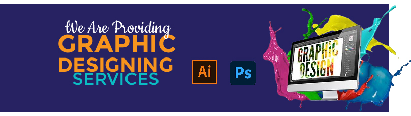
- Design Software: Adobe Photoshop, Illustrator, and Canva offer powerful features for creating custom banners.
- Stock Photo Libraries: Websites like Unsplash, Pexels, and Shutterstock provide high-quality images.
- Typography Tools: Google Fonts and Adobe Fonts offer a wide range of fonts to enhance your designs.
- Online Tutorials: Platforms like YouTube and Skillshare offer tutorials to improve your design skills.
By understanding and applying these essential tips and techniques, you can create stunning banners that effectively communicate your message and captivate your audience. Whether you're a beginner or an experienced designer, continuous learning and practice will help you master the art of banner design.